Paintings of Tropical Beaches That Bring the Ocean Indoors
Mornings in our house are loud and splashy, cereal bowls, backpacks, and socks that never match. That’s why I hang paintings of tropical beaches where we all can see them. The soft blues and warm sands calm our chaos, even on messy school days. I can almost hear the waves, and the boys quiet down, which is hard to believe!
Here’s what I’ll share, mom to mom. Why ocean art soothes a busy family. How to pick the right style and color for your walls. Simple size and frame tips. Where to buy on any budget. How to check quality without stress. Styling tricks and easy lighting ideas. Plus a fun DIY I do with my boys that you can try this weekend!
Imagine the ocean in your living room, even if you’re miles from the coast. Picture a sunny cove by the entry, or a calm reef by the kitchen table. Small choices matter. The right wave or a glowing sunset can shift the mood of a room fast, and it feels so good!

Why Tropical Beach Paintings Make Home Feel Calm and Happy

I use paintings of tropical beaches to reset our home mood when life gets loud. The cool colors, the open space, and the gentle shapes give my brain a break. The boys stop bouncing for a minute, I take a breath, and the house feels kinder. It works on school days and it works on Sundays after soccer, which still surprises me.
How ocean colors relax our brains

Soft blues and aquas signal rest to our eyes. Our brains link these hues with water and sky, which feels safe and open. When I hang art with calm color fields, my stress drops. Visual noise fades. I can think again.
I reach for:
- Cool blues for steady calm. Think still lagoons and clear water.
- Seafoam and aqua for freshness. Like a breeze through a window.
- Warm beiges and sandy creams to ground the room. They soften the edges of a busy day.
Simple scenes help the most:
- A wide sky that stretches across the canvas.
- Gentle waves that roll in soft lines.
- Smooth sand with a few tiny shells.
When a painting has clear space, my eyes rest. No heavy shadows, no hard contrast. Just a soft horizon. It feels like stepping onto a quiet beach before breakfast.
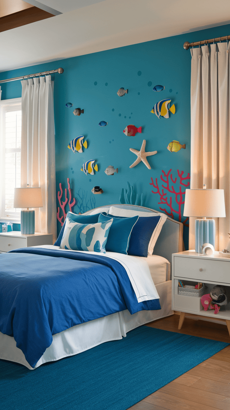
Beach scenes that soothe kids and parents

With three boys, I pick art that keeps energy low and happy. Slow waves work better than crashing surf. Open space beats packed details. My favorite family-friendly scenes include:
- Slow waves with soft foam lines.
- Open horizons with plenty of sky.
- Birds in the distance, small and calm.
- Footprints in sand that fade near the water.
Less clutter matters. A clean layout gives the brain fewer things to sort. Fewer objects, larger shapes, and soft edges create a sense of order. That quiets the mental to-do list and cuts the urge to fuss.
I use different scenes for different times of day:
- Bedtime: a pale blue sky, a thin line of surf, and smooth sand. No boats, no busy rocks. The boys stare, breathe, and settle. I turn on a warm lamp and the whole room sighs.
- Morning: a soft sunrise with peach and aqua. The light lifts our mood without adding noise. We move faster, but we stay calm. Coffee tastes better too.
If a painting feels crowded, I move it to a spot where we do not need to relax, like the hallway or play area. I keep the softest scene near the table or reading chair.
Fast mood boosters I use on busy days
I love quick wins. When the day gets wild, I shift a few small things and the house feels lighter.
- Swap in a bright sunrise during winter. Warm pinks and corals add energy without shouting.
- Add a tiny seashell dish by the entry. It hints at the beach as soon as we walk in.
- Play ocean sounds for five minutes. I pair the art with waves on my phone. We all breathe deeper.
- Use a small beach print on the nightstand. Soft horizon, tiny birds, done.
- Keep one mini frame in the kitchen. Rotate scenes with the seasons. Aqua for spring, pale blue for summer, sandy beige for fall, a glowing sunrise for winter.
- Switch to a lighter mat or frame. White or driftwood keeps the look airy.
- Set a timer for a “wave break.” We stand, look at the painting, and count five slow waves together. It resets the room.
- Place a cozy throw in seafoam. One color cue can calm a corner fast.
- Dim a lamp near the art at night. Soft light, soft colors, soft voices.
- Tuck a beach postcard on the fridge. Instant mood lift during snack time.
These tiny touches support the bigger pieces without more clutter. They invite quiet. They remind us that calm is close, even on days with sticky floors and soccer cleats by the door.
Choose Your Beach Art Style and Color Story

Style and color decide how the ocean feels at home. I like to think of them as the tide and the light. Both matter. If you love paintings of tropical beaches, the right medium and palette will help the scene blend with your family life, your walls, and your sunlight.
Watercolor, oil, acrylic, or digital print

Every medium brings a different vibe and level of upkeep. Here is how I sort it quickly on busy days.
- Watercolor
- Pros: Airy, soft edges, gentle blends, lovely in small spaces.
- Cons: Can fade in strong sun, needs a mat and glass, not ideal for damp bathrooms.
- Oil
- Pros: Rich color, classic texture, deep glow, feels luxurious.
- Cons: Higher cost, longer dry time if it is a fresh piece, heavier frames.
- Acrylic
- Pros: Bold color, fast drying, easy to clean, great for family rooms.
- Cons: Less subtle blending than oil, can look flat without good varnish.
- Giclée print (high quality digital print)
- Pros: Budget friendly, sharp detail, consistent color, easy to size.
- Cons: No original texture, value is in the image, not the medium.
Finish choices help, especially with kids and bright windows.
- Matte reduces glare, softens color shifts, and hides fingerprints. Great in sunny rooms.
- Satin adds a gentle sheen, keeps colors lively, and still controls glare. I use satin near windows for a crisp look without harsh shine.
Tip I love: if glare drives you nuts, pick matte paper with non-reflective glass, or a satin varnish on canvas. The ocean should look calm, not mirror-like.
Pick a color palette that fits your room

I keep color simple. I pull two to three hues from what is already in the space. It saves time and money, and it always looks pulled together.
- Look at your rug, sofa, or bedding. Choose one main color and one or two accents.
- Match the lightest shade to a wall or pillow. Use the boldest shade in the art.
- Keep metal and wood tones in mind. Warm woods work with warm sea tones. Cool metals like chrome love crisp blues.
Easy coastal combos that never fight your furniture:
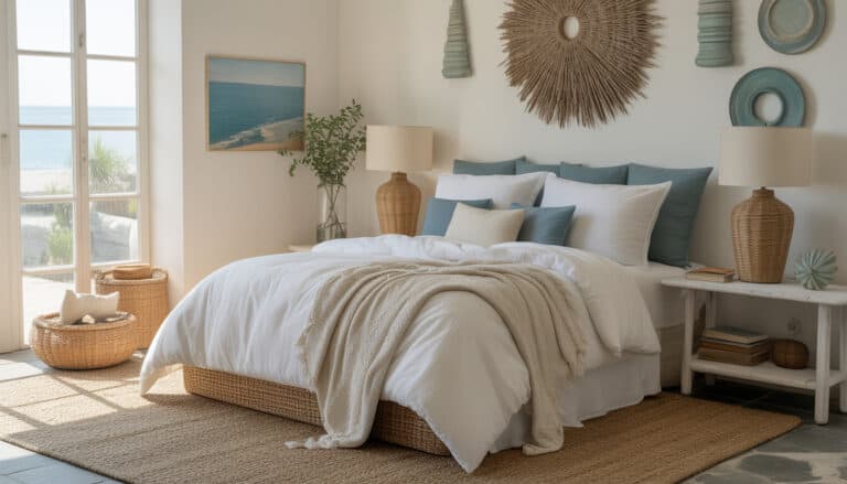
- Soft blue + sandy beige + white for a relaxed, airy feel.
- Navy + crisp white + driftwood for a clean, nautical vibe.
- Teal + warm wood + cream for a cozy, modern beach look.
Always test against your wall paint in daylight. Tape a printout or a paint swatch near the art spot. Check it morning, afternoon, and night. Colors shift with sun and lamps, which can surprise you. I learned that the hard way with a teal that turned green at 4 p.m., which drove me wild.
Example I use often: if the sofa is oatmeal, the rug has pale blue lines, and the throw is seafoam, I pick a painting with a soft sky, pale aqua shallows, and warm sand. Instant harmony.
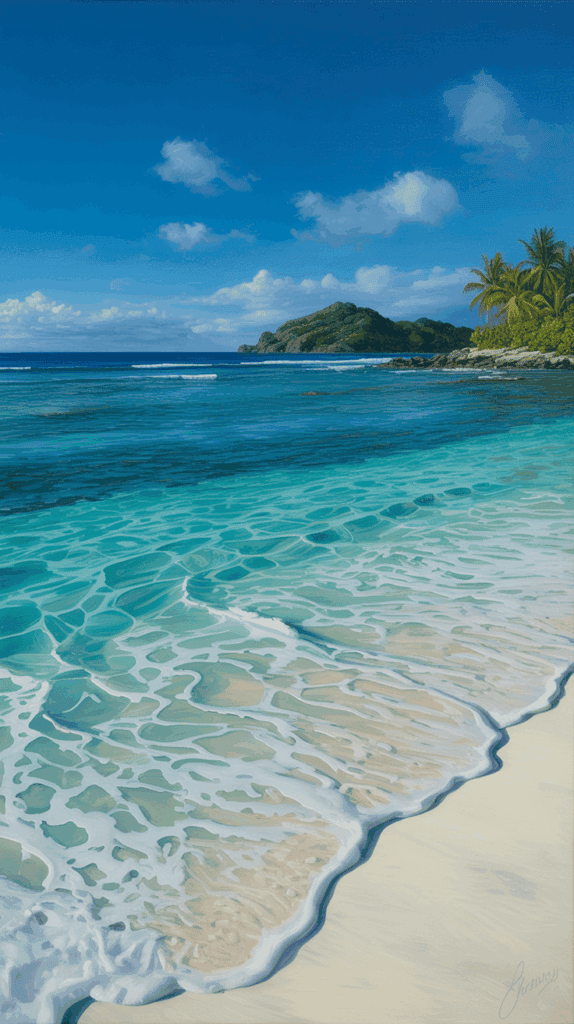
Match the mood: sunrise glow or deep teal waves

Beach scenes carry feelings, and those feelings shape the room. I choose the mood first, then the art.
- Sunrise and pastel skies feel hopeful and gentle. Perfect for bedrooms and nurseries. I use peach, blush, and pale aqua by our reading chair. The boys settle faster at night.
- Midday turquoise feels fresh and clean. Ideal for kitchens, laundry rooms, and bathrooms. It makes chores feel lighter, which I will take any day.
- Sunset oranges and corals feel cozy and social. They shine in living rooms and dining rooms. Family movie night gets a warm glow.
- Stormy seas and deep teals feel dramatic and bold. I like these in an entry, a stair landing, or an office corner. They set a statement right away.
If you need calm, keep the horizon simple and the contrast low. If you want energy, choose stronger waves, richer color, and more light on the water. Small change, big shift.
Quick room guide:
- Bedroom: soft sky, low contrast, minimal details.
- Living room: warm light, gentle movement, balanced color.
- Entryway: strong focal point, clear horizon, confident color.
- Kids area: bright aqua, clean shapes, friendly waves.
Realistic or abstract, what tells your story
Style is personal. I ask myself what I want to feel when I walk past it ten times a day.
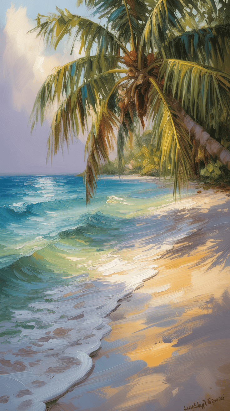
- Realistic palms and shorelines
- Best for a classic look and natural calm.
- Works with traditional frames, neutral rooms, and layered textiles.
- Great when you want a sense of place, like “that looks like our vacation beach!”
- Abstract swirls of teal and sand
- Best for modern spaces and bold mood shifts.
- Plays well with clean lines, metal frames, and simple decor.
- Great when you want color to lead the story, not the details.
If your home mixes styles, try one realistic anchor piece in the main room, then use smaller abstract prints in hallways or over nightstands. The house feels collected, not matchy.
Most important, pick what sparks joy every single day. If a soft, misty shoreline makes you breathe easier, that is the one. If a punchy teal wave makes you smile during snack time, go for it. Art should support your life with kids, not complicate it.
Size, Frames, and Placement That Look Pulled Together

This is where the pieces click. I want my walls to feel calm and balanced, so I follow a few easy rules for size, frames, and placement. These tips keep my paintings of tropical beaches looking fresh and intentional, even with boys sprinting past the sofa!
Measure once, hang once: simple size rules
I keep math friendly so I can hang art during nap time without a headache.
- Width rule: aim for art that is about two thirds the width of the furniture below it. A 90 inch sofa likes a 60 inch total art width. A 60 inch console likes about 40 inches.
- Height off furniture: set the bottom edge 6 to 8 inches above the sofa back or console. Close enough to feel connected, not floating away.
- Eye level center: keep the center of the art around 57 to 60 inches from the floor. This works for most rooms.
- Single large piece: pick one big canvas if you want clean and calm. It is fast and foolproof.
- Diptych or trio: split the scene into two or three pieces when you need width without one massive frame. Keep gaps equal.
Quick examples:
- Over a queen bed, I pick a 40 to 48 inch wide piece, about 6 inches above the headboard.
- Above a small dresser, I use a 24 by 30, centered at 57 to 60 inches. Done.
If you are between sizes, size up. Bigger looks intentional, smaller can feel like a postage stamp.
Frames and mats that feel coastal

I stick to materials that feel like sand, shell, and sun. Light, simple, easy.
- Frames I reach for
- Light oak or driftwood for warmth that still feels airy.
- White for crisp edges and a clean refresh.
- Bamboo or rattan for subtle texture that whispers beach, not theme park.
- When to add a mat
- Use a mat when the art has a busy edge or small details. It gives breathing room.
- Skip the mat for canvas or when you want a streamlined look.
- Mat colors that stay fresh
- Bright white for max contrast and a breezy feel.
- Soft white or linen when your walls are warm or the art is gentle.
- Pale sand works with warmer scenes, like sunsets or golden beaches.
- Glass and glare
- In sunny rooms, pick anti-glare or museum glass to cut reflections.
- Ask for UV protection to help colors last, especially for watercolor or prints.
- Canvas without glass also helps, just choose a good matte or satin varnish.
A quick pairing I love: teal wave print, white mat, slim light oak frame. It looks fresh in any room.
Gallery wall ideas that mix art, photos, and finds
I like gallery walls that feel like a beach day scrapbook. Playful, personal, easy to update.
Start with a plan:
- Choose one big wave piece as the anchor.
- Add smaller items around it, two inches between frames. Keep gaps consistent.
- Build outward in a loose rectangle, not a perfect grid, so it stays relaxed.
What to mix:
- Big wave anchor in the center or slightly off-center.
- Tiny beach sketch near a corner for a sweet surprise.
- Shells or sea glass in a shadow box.
- Old maps of islands or a favorite coast.
- Kids photos in black and white, so the colors do not fight the art.
- A small compass or a woven coaster for texture.
Simple layout idea:
- Place the anchor at eye level.
- Stack a vertical pair on one side.
- Balance the other side with a map and a small square print.
- Keep edges roughly even, then step back and nudge until it feels calm.
Tips that help me:
- Lay it out on the floor first.
- Use painters tape on the wall to block the outline.
- Pick two frame colors max, like white and light wood. It ties everything together.
Hanging height tips for tall and small walls

Wall size changes the rules a bit, but not by much. I keep centers aligned, then build up or down.
- Tall walls
- Stack two smaller pieces. Keep two inches between frames, align center of the pair at 57 to 60 inches.
- Use taller art to draw the eye up, like palm trunks or a vertical shoreline.
- Anchor with furniture so the art does not feel like it is floating.
- Narrow spaces
- Choose vertical art to match the shape. Slim palms, a pier, a lighthouse line.
- Use one column, not many small bits. It looks clean and taller.
- Across a room
- Keep the centers aligned for harmony. If you have several pieces, measure the center height once and repeat it across the space.
- Match frame tones so your eye glides from piece to piece.
- Renters
- Try removable hooks or strips. They hold more than you think and make swapping easy.
- Use lightweight frames and acrylic instead of glass where you can.
One last sanity saver I use: if something feels off, it is usually height or spacing. Adjust by an inch, then step back. Nine times out of ten, the room relaxes and so do I!
Style, Light, and Care Tips, Plus Easy DIY With Kids

When I hang paintings of tropical beaches, I style around them with simple, family-proof choices. I want our rooms to feel fresh, cozy, and easy to clean. Here is how I pull it together fast, even with three boys thundering through the hallway!
Style it with pillows, plants, and textures
Texture makes a beach scene feel real and touchable. I keep it simple and shoppable, nothing fussy.
Try these combos:
- Linen + rattan + ceramic: linen pillow covers, a rattan tray, and a white ceramic lamp. It feels calm and crisp.
- Cotton gauze + woven jute + glass: a gauzy throw, a jute basket for toys, and a clear glass vase with clipped greens.
- Chunky knit + light oak + seagrass: a chunky cream throw, a light wood frame, and a seagrass planter. Soft and warm.
To tie the room together, I repeat one color from the art, just once or twice:
- Pull the teal from the water into a pillow.
- Echo the sandy beige with a throw or a textured rug.
- Repeat a soft sky blue with a small ceramic pot or a candle.
A few quick picks I love:
- Linen pillow covers with zippers, easy to wash.
- Faux pothos or a snake plant for a low-fuss green moment.
- A rattan tray to corral remotes, shells, and coasters.
Keep it light, breathable, and easy to move for vacuum day. If it looks breezy, it will feel breezy!
Light it right without glare or fading

Good lighting makes the ocean glow without washing it out. I proof my lighting for evenings, homework time, and movie night.
What works for me:
- Use warm white bulbs around 2700K to 3000K for cozy evenings. The colors stay soft and inviting.
- Add a picture light if the wall needs a focal point. Battery models are great for rentals, and they install in minutes.
- Pick UV protective glass for prints in sunny spots. It helps prevent fading, especially for watercolor and giclée.
Placement tips to fight glare:
- Hang art across from windows at a slight angle, not straight on with glass.
- Shift lamps so the bulb does not point directly at the artwork.
- If a window shines on your art at noon, try matte paper, museum glass, or a satin varnished canvas.
At night, I like one lamp near the art, set lower than eye level. It adds a soft glow that feels like sunset on water.
Care tips for busy homes and sticky fingers
I keep cleaning easy and gentle. Less is more, especially with originals and prints.
My basics:
- Dust frames and canvas with a soft brush or a dry microfiber cloth.
- Skip sprays and cleaners. Liquids can streak glass, stain mats, or dull varnish.
- For glass, use a slightly damp microfiber, but spray the cloth, not the glass.
High humidity spaces need extra care:
- Bathrooms can warp paper art. Use sealed frames with tight backs and UV glass. Keep the fan on during showers.
- Canvas in a bathroom should have a protective varnish. Ask for matte or satin.
- Avoid hanging unframed paper near steamy sinks. A small laminated print can take the splash zone better.
If something sticky lands on a canvas, I wait for it to dry, then lift gently with a dry cotton swab. If in doubt, I leave it alone and call a framer.
Easy weekend DIY ocean art with kids
This one is a hit at our kitchen table! It is fast, washable, and full of smiles.
What you need:
- Washable tempera or kids acrylic in blue, teal, white, and sandy beige.
- Painter’s tape for clean stripes and borders.
- Sponges and a wide brush.
- Heavy paper or a canvas panel, 9 by 12 or 11 by 14.
Steps we follow:
- Tape a border, then add one or two tape stripes for “horizon” lines.
- Paint sky first with a brush, soft blue mixed with white.
- Dab the water with a sponge, light to dark, to make gentle waves.
- Peel tape while paint is slightly wet for sharp lines.
- Sponge a sandy corner with beige and a touch of white for texture.
Make it a memory piece:
- Glue a tiny jar of vacation sand to a corner of the frame, or place it on the shelf beside the art.
- Add a photo label on the back with the beach name and date. I write ours with a paint pen. It makes me teary in the best way.
Dry time is quick, clean up is easy, and the kids feel proud. The best part, it sits right next to your real art and looks sweet, not messy.

Conclusion
I keep coming back to this simple truth, paintings of tropical beaches make home feel softer, kinder, and easier to breathe in. One beach scene can shift the mood of a whole room, from breakfast chaos to a calmer rhythm. The colors hug the space, the horizon gives our eyes a place to rest, and the day feels manageable. My boys notice when I swap art, and it sparks sweet conversations about the ocean and our favorite family trips. That shared moment is the real magic, and it lasts long after the dishes are done.
Pick one piece this week, measure a spot, and try it. Start small if that feels better, a framed print over the dresser, a gentle sunrise by the table, a quiet shoreline by the bed. Give it a day, then notice how the room behaves. If it feels easier to sit, read, and breathe, you nailed it! Share your space or try the DIY with your kids, then tell me what you picked and how it changed your home.
This post may contain affiliate links. Read the full disclosure here.