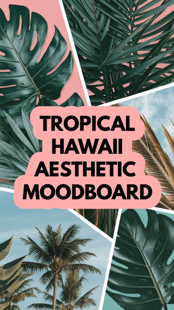
Aesthetic Hawaii iPhone Wallpaper for Island Daydreams
The breakfast dishes were still warm, the school forms were half signed, and my three boys were turning couch cushions into a pirate ship. I needed a tiny reset, just one calm thing. I changed my lock screen to an aesthetic hawaii iphone wallpaper, and I could almost hear waves. Soft coral skies, palms, and turquoise water slowed my breathing, which is hard to believe, but it works. That tiny swipe to wake my phone felt peaceful, even with sneakers flying.
Here’s what I’m sharing today, and it’s simple and fun. I’ll show you the best Hawaii wallpaper ideas for a soothing screen that still feels happy. You’ll learn how to pick colors and compositions that look clean, how to crop and edit so icons stay readable, and where to safely find or create images without stress. I’ll also walk through iOS setup tips, like Focus, widgets, and minimal app layouts, for a kid-friendly phone that stays tidy. By the end, you’ll have a calm, beachy screen you’ll love to see during snack time, soccer runs, and late-night laundry.

Why Hawaii wallpapers help my busy mom brain relax
When my brain feels noisy, I give my screen a tiny vacation. A soft beach photo, a palm silhouette, or a calm wave helps me slow down. An aesthetic hawaii iphone wallpaper works like a little pause button, right in my hand. It sets a peaceful tone before the next snack refill or pickup run. I want my phone to look pretty, but also clean and easy to use. Hawaii scenes do both.
The calming power of ocean colors
Ocean colors are gentle on busy eyes. Blues, teals, and soft sunset pinks feel cool and steady. They make my shoulders drop a little, which is a win on any day.
Those shades also help with clarity. App icons and widgets pop when the background is calm. I look once, and I can find the timer or calendar without squinting.
I like gentle gradients that fade from sky blue to coral. It looks clean, not busy. A lightly textured water shot works too, with soft ripples or foamy edges. The key is balance. Calm color, simple detail, and nothing that fights the time or notifications.
Quick tips I use:
- Pick a quiet palette: teal, sea glass green, powder blue, shell pink.
- Keep the middle area simple so the clock stays readable.
- Avoid bright, harsh contrast that competes with text.
- Test dark and light modes to check legibility.
Micro daydreams between mom tasks
I use my lock screen as a cue to breathe. When I tap to wake my phone, I take a short pause. Ten seconds is enough. It feels like standing at the shore, even if I am holding a lunchbox.
Here is my quick ritual:
- Inhale for 4, eyes on the horizon line in the photo.
- Hold for 2, shoulders soft.
- Exhale for 4, watch the waves in the image.
- Smile for 2, then unlock.
I also pair it with timers. While a pasta pot boils or homework runs for 15 minutes, I start the timer and take one slow breath cycle. It keeps my tone kind, which matters when everyone talks at once. The screen becomes a tiny reset, not just a to-do list.
Small cues that help me:
- Wave = breathe. Every time I see water, I inhale once.
- Sunset = soften. Lower voice, relax forehead.
- Palm shadow = pause. Count to three before I answer the next “Mom!”
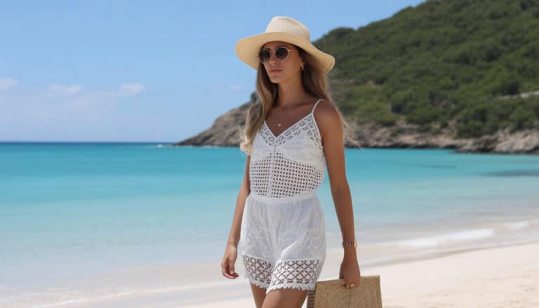
Cute, kid-approved scenes that still look chic
My boys love fun wallpapers, and I like a tidy look. We meet in the middle with playful, simple scenes that keep text clear. I pick one cute subject, then use clean space around it.
Kid favorites that still look stylish:
- Sea turtles drifting over pale aqua. Place the turtle low or off-center so the clock is clear.
- Rainbows in soft pastels. Thin arcs, lots of sky, no busy clouds.
- Surfboards lined up on sand. Keep them small, use a blur on the background.
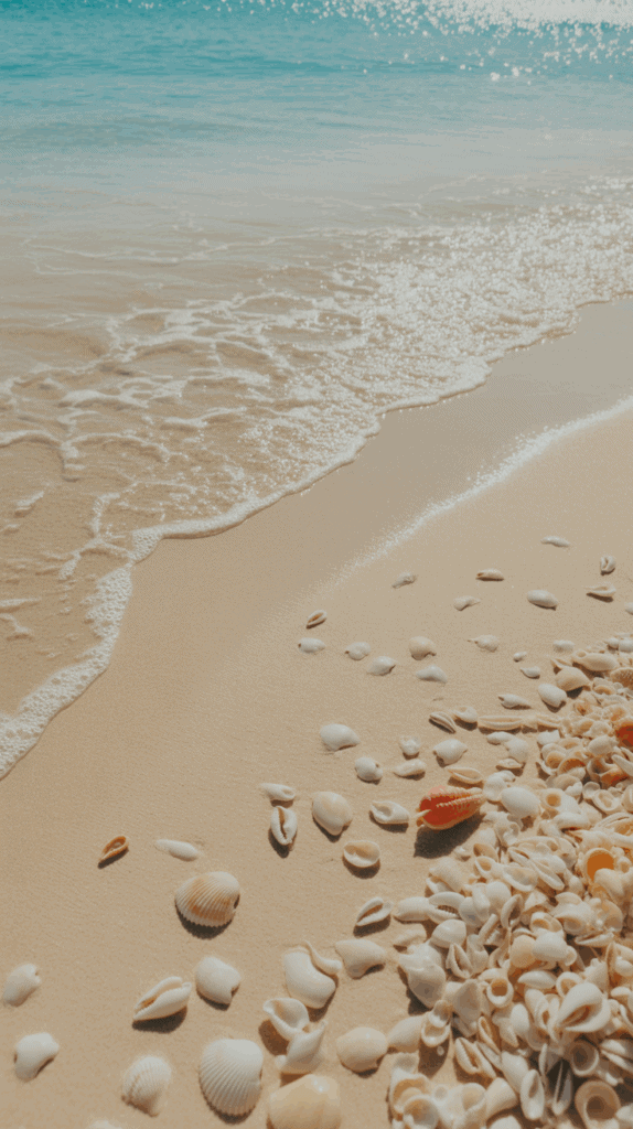
- Beach shells on ivory or light tan. One shell, big enough to feel fun, with space for widgets.
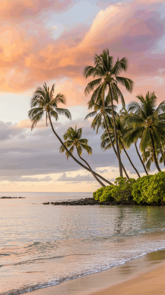
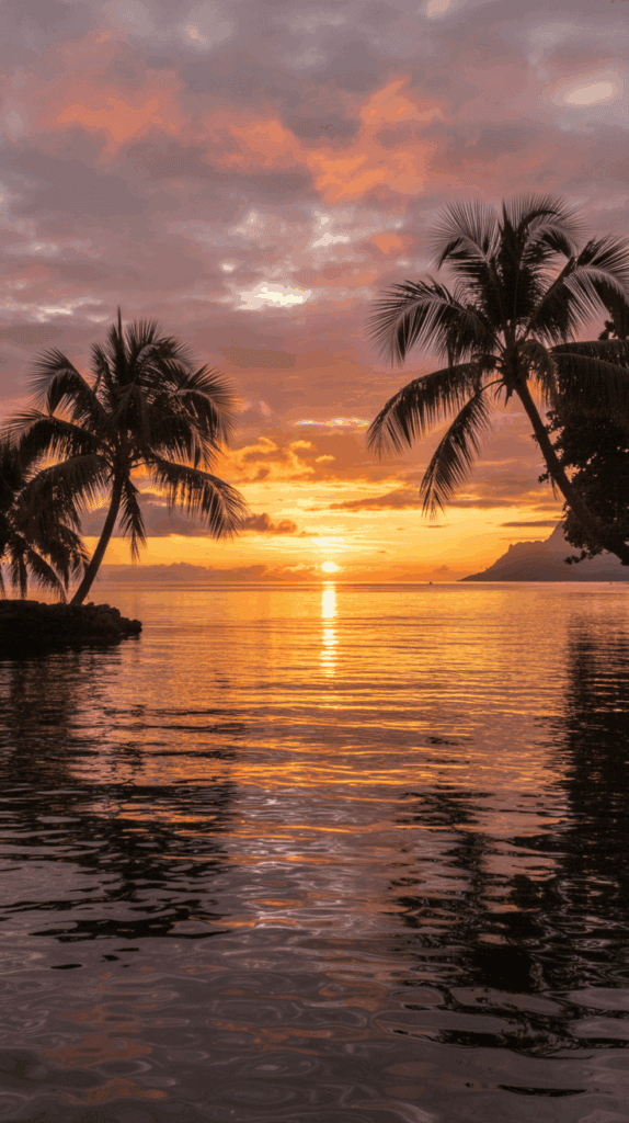
- Palm tree silhouettes on a peachy sky. Dark leaves, light background for contrast.
Design tricks that work:
- One focal point. Skip collages that crowd the screen.
- Neutral sand or sky behind the time and widgets.
- Soft blur to push busy details back.
- High-contrast text area so alarms and messages are readable.
The best part, the kids feel included, I get a calm screen, and my phone stays useful. It looks cute during family time, then stays practical when I need to focus. Simple, happy, and easy to scan, which is exactly what a mom brain loves!
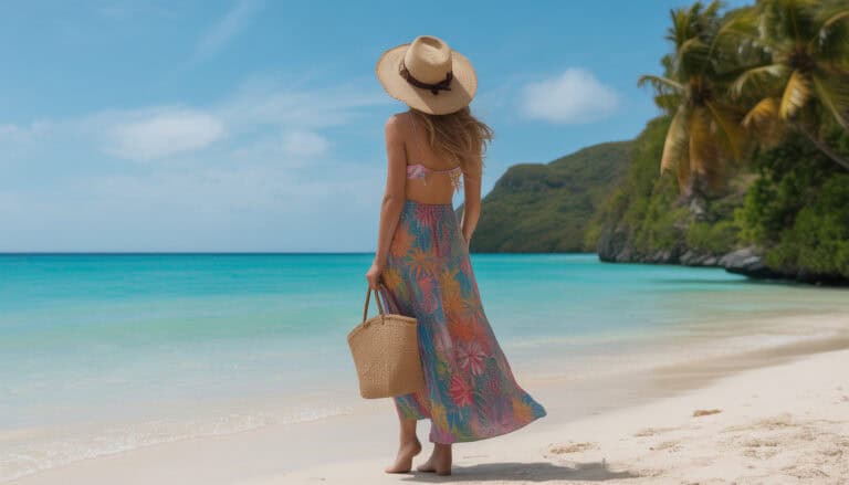
Hawaii iPhone wallpaper ideas that look clean and happy
I reach for calm, happy scenes that are simple to read at a glance. An aesthetic hawaii iphone wallpaper feels light and joyful, which is exactly what my busy mom brain needs between snack refills and homework checks. I keep the colors soft, the subject clear, and the middle area open so the time and widgets stay crisp.
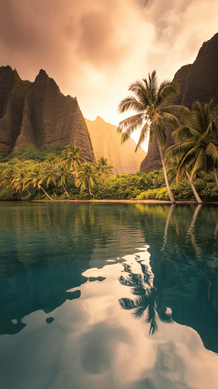
Pastel beaches and soft sunsets
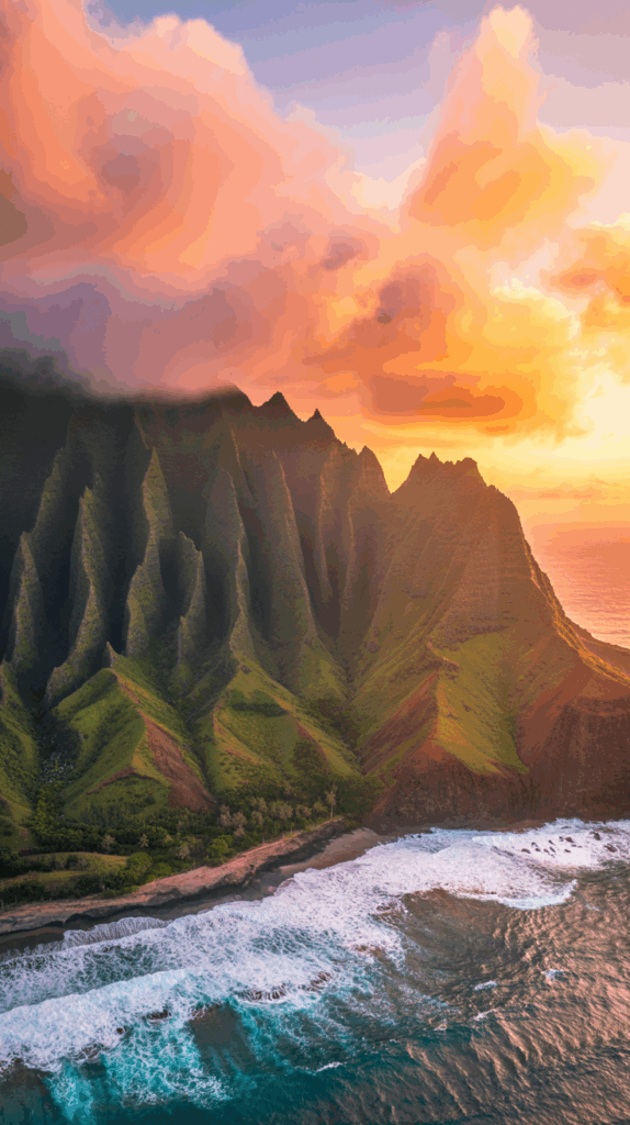
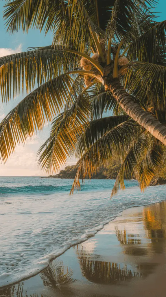
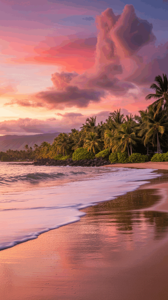
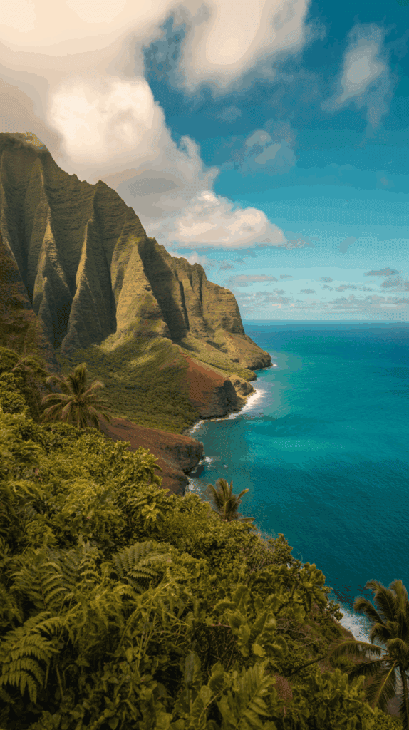
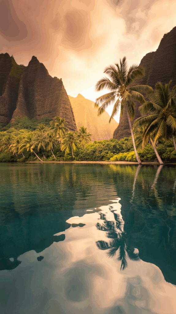
Pastel beaches soothe the eyes and set a gentle mood. Think Waikiki at sunrise with cotton-candy clouds, Lanikai at golden hour with warm sand, or Hanalei Bay at dusk with glassy water. I look for soft light, small waves, and a wide horizon.
I like scenes with pale aqua water and peach skies. The blend looks clean and still feels happy. I leave the top center light for the lock screen clock.
Tips that help:
- Keep the horizon low to avoid hiding the time.
- Use soft focus on distant clouds to reduce clutter.
- Skip busy crowds so icons stand out.
Try these search terms:
- pastel beach wallpaper
- Hawaii sunset iPhone
- Lanikai sunrise background
- Waikiki pastel sky
- Hanalei Bay dusk phone
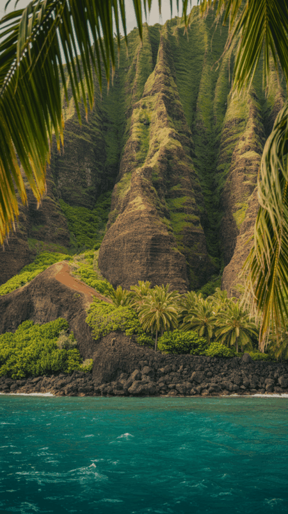
Palm leaves, plumeria, and hibiscus close-ups
Close-ups feel chic and calm, especially with negative space. A single palm frond, one plumeria bloom, or a hibiscus petal looks fresh without clutter. I aim for one subject with lots of quiet background.
I place the flower or leaf on the lower third, then leave room for widgets. Pale sand, soft sky, or a blurred wall makes a great backdrop. It feels polished, not busy.
Simple rules I use:
- One bloom only, centered low or off to the side.
- Plenty of space around the subject for text.
- Low contrast between background tones so icons pop.
Helpful search terms:
- palm leaf minimal
- plumeria wallpaper
- hibiscus macro aesthetic
- single plumeria iPhone
- minimal tropical flower
Sea turtles, surf, and outrigger canoes
Playful can still be clean. A single honu gliding over clear water makes a sweet lock screen that kids love, and it reads well. Surf lines on pale aqua or an outrigger canoe silhouette at sunset also look neat and calm.
I keep the subject off-center so the clock stays readable. Upper middle space stays open. If the water has lots of detail, I add a light blur.
Smart composition ideas:
- Place the turtle low left or low right to avoid the time.
- Use soft color water, not deep navy, for better contrast.
- Silhouette canoes at sunset, but keep the sky bright enough for white text.
Search terms to try:
- Hawaii sea turtle iPhone
- honu clear water wallpaper
- surf lines minimal
- outrigger canoe silhouette
- calm wave background
Minimal gradients and vintage aloha patterns
When I want zero distraction, I pick a gentle gradient. Aqua to coral, sea glass green to ivory, or pale lilac to blush feels soft and cheerful. It looks modern, and my icons stay easy to read.
Vintage aloha prints are fun too. I choose subtle patterns with faded ink or tone-on-tone flowers. Low contrast keeps labels and widgets clear while still giving a tropical wink.
Guidelines that keep it tidy:
- Stick to 2 or 3 colors, not a rainbow.
- Aim for low-contrast prints, like washed linen or soft ink.
- Test light and dark mode to confirm text stays readable.
Search terms that work:
- aqua to coral gradient iPhone
- sea glass gradient wallpaper
- vintage aloha print subtle
- tropical pattern tone on tone
- soft Hawaiian textile background
Quick reminder I use with every wallpaper:
- Keep the top center clean for the clock.
- Place the focal point off-center.
- Favor soft color and minimal texture.
- Test how it looks with notifications.
Choose and edit the perfect image for your iPhone
When I pick an image, I want calm first, then clarity. My lock screen needs to make room for the time, widgets, and quick taps during snack chaos. An aesthetic hawaii iphone wallpaper can look dreamy, but it still has to be practical for school pickups and grocery runs. Here is how I get a pretty, readable screen that feels peaceful all day!
Best size and crop for modern iPhones
Modern iPhones are tall, so I start with a portrait image that fits the current screen shape, about a 19.5:9 aspect ratio. I export at or above 3000 pixels tall for crisp edges and clean text. Bigger is fine, as long as the crop is smart.
I always leave a safe margin. The top center needs breathing room for the Dynamic Island and time. The bottom needs space for the Home bar, so nothing important gets covered or warped.
Quick setup that works every time:
- Use a tall portrait crop, close to 19.5:9.
- Export at 3000 to 3200 px tall, or larger, for sharpness.
- Keep the top center light and simple, so the clock stays readable.
- Protect the bottom from text and logos, the Home bar sits there.
If I am editing a beach shot, I pull the horizon a bit lower than center. Palms, turtles, or surfboards sit away from the top middle. I also preview with the lock screen clock on, then nudge the image until everything lines up.
Composition that keeps icons readable
Readability is everything. Negative space is my secret, it is the quiet area in a photo with little detail or contrast. That soft space gives the time, widgets, and notifications room to breathe.
I place the main subject lower or off to one side. A palm frond on the left third, a small honu near the bottom right, or a soft wave line near the lower third all keep the center clear. If the background is busy, I add a slight blur or gentle bokeh to calm it down.
Tips that make icons pop:
- Think in thirds. Keep the subject low or off-center.
- Create negative space where the clock sits, usually top center.
- Use slight blur on busy textures, like detailed leaves or choppy water.
- Avoid hard edges behind text, high contrast can make the clock harder to read.
Simple example I love: a pale aqua water shot with a single sea turtle low left, soft ripples, and a clean sky top center. The time is crystal clear, and the screen feels calm and sweet.
Light vs. dark wallpapers for all-day use
I switch between light and dark, and it helps my eyes and my battery. My simple rule is easy to remember. Lighter images for morning pep and sunny afternoons. Darker images for evening calm and battery savings on OLED screens.
I keep two versions of the same wallpaper. One bright, one moody. Then I connect each to a Focus mode, so my phone shifts on its own.
Here is how I set it:
- Edit a light version with soft sky or pastel sand.
- Edit a dark version with deep teal water or a dusky sunset.
- Save both at the same tall crop with safe margins.
- Assign the light one to my Day Focus and the dark one to my Evening Focus.
Smart extras that help:
- Light mode pairs well with pastel beaches and gentle gradients.
- Dark mode loves silhouettes and soft dusk skies.
- Test notifications on both versions to check contrast.
- Watch battery over a day or two, darker screens often last longer.
This simple setup keeps my phone kind on my eyes, clean for quick taps, and peaceful when the house gets loud. It is a small change, but it feels like a breath of ocean air every time I wake the screen!
Safe places to find or create Hawaii wallpapers
When I want a calm phone, I stick to safe sources and simple edits. I use my own photos when I can, then mix in trusted libraries, paid artist packs, or gentle AI art. That way, my screen feels peaceful and legal, and my kids see pretty images we can be proud of. If you want an aesthetic hawaii iphone wallpaper, here are easy, mom-proof options that work every time.
My own photos and simple iPhone edits
I love using my own shots. It feels personal and clean. I keep it simple and slow, even with little feet running circles around me.
Easy plan I use:
- Shoot at golden hour for soft color and gentle shadows.
- Frame one clean subject, like a palm or one shell on sand.
- Tap to focus, then adjust exposure with a tiny slide down.
- Edit in Photos, VSCO, or Lightroom Mobile. I brighten a touch, soften highlights, and cool down colors for a calm look.
- Crop vertical, and leave space for the clock at the top center.
Quick edit recipe:
- Exposure +0.2 to +0.4
- Highlights down a bit for soft skies
- Clarity or Sharpen low to avoid harsh edges
- A light vignette to pull eyes to the center
I test on the lock screen, then nudge the crop until the time sits in clean space. Done!
Free stock libraries with legal downloads
When I need a backup, I search Unsplash and Pexels. Both offer free photos with generous licenses for personal use. I still read the license page, since people and private places can have extra rules.
How I search fast:
- Filter for vertical orientation for a perfect phone fit.
- Use focused terms like:
- Hawaii beach minimal
- plumeria macro
- tropical gradient
- Skim for clean skies, soft water, and one main subject.
Smart checks before saving:
- Open the largest size for crisp text.
- Look for low-contrast areas where the clock will sit.
- Avoid busy crowds or heavy text overlays.
Support artists with paid packs
Paying creators feels good, and the quality is often amazing. I shop on Etsy, Gumroad, or from creators on Instagram who sell wallpaper sets.
Before I buy, I check:
- Resolution. Aim for tall, high-res files for sharp icons.
- Vertical orientation or included phone crops.
- Permission for personal use. Most packs are perfect for phones but not for resale.
Why I love it:
- The files are curated and color graded with care.
- I find unique scenes, like soft pastel beaches or vintage aloha textures.
- I get to support the artist behind the beauty, which always feels right.
Make AI art with simple, kind prompts
AI tools are handy when I want a gentle gradient or a clean scene with lots of negative space. I keep my prompts kind and simple, and I avoid naming living artists.
Try prompts like:
- minimal Hawaii pastel beach, soft gradient sky, negative space, iPhone wallpaper, vertical
- sea glass green to coral gradient, subtle texture, calm, vertical
- single palm silhouette, peach sky, clean space for clock, vertical
Friendly rules I follow:
- Be ethical. No copying living artists by name.
- Be respectful of Hawaiian culture. Avoid sacred sites or symbols unless you understand their meaning.
- Use AI for soft abstracts, gradients, or simple scenes, not for copying someone else’s style.
I always export tall, leave room for the clock, and test in light and dark mode. Clean, calm, and ready for a busy day with kids and snacks and all the things!
Set up and style your iPhone for island daydreams in iOS

I turn tiny moments into beach breaks with a quick setup, which helps me breathe while the boys race toy cars. This is where the magic of an aesthetic hawaii iphone wallpaper meets iOS tools. I keep it simple, clean, and calm so my screen feels like a soft wave and not a chore list.
Set lock and home screens in a few taps
I set a new screen in under a minute while snacks cool. The steps are easy and repeatable.
- Long-press the Lock Screen until the gallery view appears.
- Tap the plus sign to add a new screen.
- Choose Photos to pick one image, or Photo Shuffle to rotate a set.
- Adjust the crop, then tap Add.
- Tap Set as Wallpaper Pair, or choose Customize Home Screen to pick a different image for your Home Screen.
Helpful choices:
- Photos is perfect for one favorite beach shot.
- Photo Shuffle lets you choose a small set. I use four or six images with similar colors.
Keep the Lock Screen light and clear at the top center. For the Home Screen, I choose something even softer so icons stay readable. A gentle gradient or a blurred beach works best.
Example I love: a pale aqua wave for Lock, then a blurred peach sunset for Home. It looks calm and tidy, even with toddler fingerprints.
Use Depth Effect, Shuffle, and Focus-linked screens
These extras add charm without the clutter. I use them when I want a tiny lift during noisy days.
- Depth Effect: This works best when the subject has strong edges and sits slightly in front of the clock area. Think a palm frond tip, a single surfboard, or a turtle fin peeking into the top third. It needs a clear subject and separation from the background. If it fails, try moving the subject or picking a simpler photo.
- Photo Shuffle: I create a set of beach images with the same vibe, like pastels or soft teal water. I pick Shuffle frequency as hourly or daily, not every tap. It keeps things peaceful, not jumpy.
- Focus-linked screens: I tie wallpapers to Focus modes so my phone shifts with my day.
- Bedtime Focus: a dark teal water shot or a dusky sky to rest my eyes.
- Work Focus: a bright, clean beach or a minimal gradient for clarity.
- Family Focus: a playful palm silhouette or a soft turtle shot that the kids love.
How I link them fast:
- On the Lock Screen edit view, tap Focus.
- Pick the Focus to link.
- Repeat with a second wallpaper for another Focus.
The result feels natural. Calm at night, crisp by day, and sweet for family time.
Widget and icon color tips for a calm home screen
I keep the Home Screen uncluttered so I can find what I need in two taps. Less is kinder to busy eyes.
- Use one or two widgets only: I like a small Calendar and a small Reminders. That gives me the day at a glance without noise.
- Match icon colors to the wallpaper palette: Pick icons that echo the main shades in your background. If your wallpaper is sea glass green and peach, aim for app icons in soft greens, creams, and warm pinks. Avoid neon red or harsh black if they clash.
- Keep the dock clear if you can: I keep only Phone and Messages there. Some days I go with a single app in the center. Empty space feels like a deep breath.
Quick color guide that helps:
- Pale aqua water wallpaper, pair with light blue, ivory, and mint icons.
- Peach sunset wallpaper, pair with warm beige, blush, and soft brown.
- Dark teal night wallpaper, pair with muted teal, slate, and off-white.
Simple layout that works:
- Top row empty for visual space.
- One small widget on the left, one small widget on the right.
- Two or three rows of apps you use daily.
- Extras sent to the App Library.
If I want custom icons, I swap a few key apps using Shortcuts or a simple icon pack. Only a handful, not the whole phone. It keeps setup quick and the look consistent. Calm colors, fewer shapes, and breathing room make the whole screen feel like a quiet beach morning.
Conclusion
Soft ocean color, simple shapes, and clean spacing turn my phone into a tiny pause between snacks and soccer gear. With one thoughtful image, I get calmer mornings and easier nights. An aesthetic hawaii iphone wallpaper keeps the clock readable, the icons tidy, and my brain a little lighter. The best part, tiny edits make a big difference. A gentle gradient, a single palm, or one turtle with plenty of negative space gives me breath room when the living room turns into a jungle gym.
If you want an easy win today, pick one wallpaper idea and set it now. Try a pastel beach for mornings, then add a darker palm or plumeria for evenings, tied to Focus. Rotate a small set so your screen stays fresh without noise. Tiny visual changes lower stress during busy mom life, they really do. I feel kinder, I move slower, and I find my timer without squinting.
Grab a photo you love, make space for the clock, and save it as a pair. Take one slow breath every time you wake your phone. Your screen can be a calm cue, not another chore. You deserve a little island daydream on the go, so try one today and enjoy that soft, happy glow!
This post may contain affiliate links. Read the full disclosure here.